


HTML and CSS Fundamentals in 2026: The Foundation Every Developer Needs
By Irene Holden
Last Updated: January 18th 2026
Key Takeaways
HTML and CSS fundamentals are still the foundation every developer needs in 2026 because the browser platform is the stable layer under frameworks, libraries, and AI - knowing semantics, the box model, Flexbox/Grid, and the cascade lets you diagnose and fix the last 20% that tools miss. Modern features like container queries, subgrid, native nesting, and :has() are now supported in major browsers, and those core skills compound across stacks (Bootstrap still sees roughly 2.5 million weekly installs); structured learning - such as a 22-week full-stack track - helps turn fundamentals into job-ready ability.
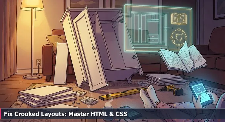
The wardrobe in the middle of the living room
Picture that half-built wardrobe again: one door hanging crooked, the other refusing to close, extra screws glinting on the floor, the paper manual stuck on step 9 while a YouTube video is paused on your phone. Up to a point, the instructions felt fine. Then one hole didn’t line up, one step got done slightly out of order, and suddenly you’re not “assembling furniture” anymore - you’re guessing and hoping you don’t crack something.
For a lot of beginners and career-switchers, HTML and CSS feel exactly like that moment. Tutorials, no-code tools, CSS frameworks, and now AI all act like the instruction booklet: they walk you through building a landing page, a portfolio, or a simple app. You copy the code, things look okay in Chrome on your laptop, and you feel like you’re getting it - until a layout explodes on mobile, or you need “just a small change” your template never anticipated. Then you’re staring at misaligned sections, mystery margins, and utility classes no one wants to touch, the web equivalent of that crooked wardrobe door.
Why this isn’t just “you not being good at CSS”
This gap isn’t about you being bad at tech; it’s about the difference between knowing HTML/CSS as a checklist and understanding them as a system. Knowing is “I’ve seen <header>, I’ve used flexbox once, I can paste a Tailwind snippet.” Understanding is being able to look at a broken layout the way a good furniture builder looks at that wardrobe: you can see the invisible grid of pre-drilled holes - the box model, Flexbox, Grid, the cascade - and reason your way back to level doors without guessing.
Developers who’ve been around a while keep saying the same thing: tools change, the web platform doesn’t. One review of whether it’s still worth learning web development calls HTML, CSS, and JavaScript “global skills” that travel with you no matter which framework or country you end up in. That matters even more now that AI can spit out entire responsive sections on command. If you already understand the joinery, AI is a cordless drill that speeds you up. If you don’t, it’s just a faster way to over-tighten the wrong screw and strip the wood.
How this guide (and structured learning) fits in
What we’re going to do here is walk through HTML and CSS the way you’d walk around that wardrobe with a bubble level in your hand. We’ll look at semantic HTML5, modern layout tools like Grid and subgrid, container queries, and selectors like :has() - but always through the lens of “How does this keep the doors straight?” rather than “Here’s yet another property to memorize.” The goal is that when your AI assistant, your React component library, or your no-code builder hands you something that’s 80% right, you know exactly how to shore up the last 20% without panic.
If you’d rather not do all of this entirely alone, there are programs built around this idea of compounding fundamentals. For example, a full stack bootcamp like Nucamp’s spends 22 weeks taking you from HTML, CSS, and JavaScript through React, React Native, Node.js, and MongoDB for about $2,604 in early-bird tuition, with 10-20 hours a week of work and live support. Whether you learn in a bootcamp or on your own, the mission is the same: stop feeling like you’re stuck on step 9 of the manual, and start seeing how the whole thing goes together so you can build, fix, and adapt with confidence.
In This Guide
- Introduction - The wardrobe problem and your web foundation
- Why HTML and CSS still matter in 2026
- How the web is put together
- Semantic HTML5: landmarks, meaning, and accessibility
- CSS core concepts that stop layouts from leaning
- Modern layout: Flexbox, Grid, and subgrid
- Responsive design beyond media queries
- Modern CSS power tools: variables, nesting, and :has()
- Frameworks and UI libraries: Tailwind, Bootstrap, shadcn/ui
- Working with AI without losing your skills
- A practical learning roadmap for HTML and CSS
- Bootcamps, careers, and going deeper
- Frequently Asked Questions
When you’re ready to ship, follow the deploying full stack apps with CI/CD and Docker section to anchor your projects in the cloud.
Why HTML and CSS still matter in 2026
Under the hood, it’s still the same wardrobe
Strip away the buzzwords and the web is still the same basic piece of furniture: HTML for the boards and shelves, CSS for the invisible system of pre-drilled holes that makes everything line up. React, Tailwind, Bootstrap, WordPress, Webflow, even AI page builders are just different instruction booklets and power tools bolted on top. No matter which one you use, the browser always ends up rendering plain HTML and CSS. Modern rundowns of CSS features point out that things which were “too new for production” a few years ago - like container queries, the :has() selector, and native nesting - are now part of the everyday baseline in all major browsers, not fringe experiments. That means the joinery got more powerful, not less important.
The reason it still feels like your wardrobe is leaning is that most tutorials stop at “follow these steps” instead of teaching you how the system works. They hand you a React component or Tailwind snippet that looks good in the screenshot, but the moment you swap an image, change some copy, or view it on a tablet, something shifts. You add a magic number here, an extra utility class there, and suddenly you’ve got the web equivalent of mystery screws on the floor - nobody’s sure what they do, but everybody’s afraid to throw them away.
AI raised the floor, not the ceiling
AI has made this even more confusing. You can ask a model to “build a responsive landing page with a hero, feature grid, and pricing cards,” and it will return perfectly reasonable HTML and CSS in seconds. That’s real, and it’s useful. But what you get back is still a best-guess wardrobe: it works as long as you don’t bump it too hard. The moment you need accessible form labels, subtle layout changes inside a complex component, or to untangle a conflict between your existing styles and what the AI just generated, you’re back to staring at the crooked door.
“Core web fundamentals still matter.” - Sunil Yadav, Software Engineer, in a LinkedIn article on why these skills remain critical despite new tools
Developers writing about the AI era keep coming back to the same idea: you’re becoming more of an orchestrator than a code typist. A piece on why “frameworks won’t save front-end” argues that while tools churn, the web platform (HTML, CSS, JavaScript, HTTP) is stable and compounds over time, and that’s echoed in front-end fundamentals discussions on Medium. If you already understand how the panels are supposed to fit, AI is a cordless drill that lets you assemble faster. If you don’t, it just gives you the power to strip screws and crack particleboard at high speed.
Skills that compound over a career
From a career perspective, HTML and CSS are weirdly durable. Frameworks come and go; even React’s dominance is treated as “strong but not guaranteed” in future-proofing debates. Meanwhile, HTML semantics and modern CSS layout show up on every serious roadmap and in roles that didn’t even exist a decade ago: accessibility specialists, design-system engineers, performance-focused front-end devs. Even in the framework-heavy world, Bootstrap alone sees around 2.5 million weekly installs on npm, yet its grid, components, and responsive utilities are just opinionated wrappers around Flexbox, Grid, and media queries, as described in a Strapi overview of modern CSS frameworks.
- HTML and CSS let you debug any page, whether it was built by a senior engineer, a drag-and-drop builder, or an AI model.
- The concepts you learn - box model, cascade, semantic structure - transfer directly into React, React Native, and even email templates.
- Every hour you invest here compounds, because the web’s core “physics” change slowly, even while tools and job titles churn around them.
How the web is put together
Seeing the layers instead of just “some code”
When a page breaks, most beginners see a wall of code the way you see that pile of panels, screws, and half-used instructions on the floor. What helps is realizing the web isn’t one big mysterious thing; it’s a few simple layers stacked together. At the core you’ve got HTML describing what’s on the page, CSS describing how it should look and be arranged, and the browser acting like a physics engine that applies a bunch of rules to turn that into pixels. Once you can separate those layers in your head, you stop randomly poking at everything and start asking, very specifically, “Is this a structure problem, a styling problem, or a browser-layout problem?”
HTML: structure and meaning
HTML is just a structured outline of your content with hints about what each piece means. Headings, paragraphs, lists, links, buttons, forms, and semantic landmarks like <header>, <nav>, <main>, and <footer> tell the browser, search engines, and assistive tech what each region is for. A screen reader, for example, can jump straight to the main content because you used <main>, and a search engine can understand that a block is an article, not just a random div. Modern references like the MDN HTML learning area treat this semantic layer as non-negotiable, not an advanced topic, because your CSS and JavaScript sit on top of whatever structure you define here.
- “What is this?” → heading, paragraph, image, list item, button, input
- “How is the page organized?” → header, navigation, main content, sidebar, footer
- “What’s the reading order?” → the DOM (document tree) built from your HTML
CSS: layout and visual rules
CSS is where you decide how those HTML pieces should look and line up. Colors, fonts, spacing, borders, and - crucially in modern frontend work - layout systems like Flexbox and Grid all live here. Newer capabilities such as container queries, native nesting, and the :has() selector give you far more control without JavaScript, but they still follow the same underlying ideas: every element is a box; boxes sit in layout contexts; and the cascade decides which rule wins when there’s a conflict. When you understand that, Tailwind utilities, Bootstrap classes, or AI-generated style blocks all become different ways of writing the same CSS concepts instead of magic incantations.
- “Where does this go?” → layout (block, flex, grid, position)
- “How big is it?” → width, height, padding, border, margin
- “How does it look?” → color, typography, backgrounds, effects, animations
The browser as the “physics engine” tying it together
Once you’ve written HTML and CSS, the browser parses them into internal models (the DOM and CSSOM), figures out which CSS rules apply to which elements using the cascade and specificity, runs layout algorithms (Flexbox, Grid, etc.), and finally paints pixels to the screen. It does this the same way whether the source came from a hand-written HTML file, a React app, a WordPress theme, or an AI suggestion. That’s why learning to use your browser’s developer tools is such a superpower: inspecting an element shows you its HTML structure, the CSS rules that currently win, and the box model it’s using. Over time, you start to “see” that invisible system even without devtools, and the web stops feeling like random guesswork and more like a set of consistent physical laws you can rely on when you build.
Semantic HTML5: landmarks, meaning, and accessibility
Landmarks that give your page a map
Using semantic HTML5 is like finally noticing the tiny symbols stamped on each wardrobe panel: this one’s a side, this one’s a door, this one’s a shelf. Elements like <header>, <nav>, <main>, <article>, <aside>, and <footer> are “landmarks” that tell browsers and assistive tech what each region is, not just how it looks. A screen reader can jump straight to <main> or <nav>, and search engines can tell the difference between a reusable article and a random block of text. In beginner-friendly resources like the semantic HTML walkthrough by Kevin Powell, this is framed not as an optional polish step but as the core of building understandable pages.
Compare two versions of the same layout. One is a wall of <div> tags with classes like “box1” and “wrapper2”; the other uses a single <header> with a nested <nav>, a <main> containing multiple <article> elements, and a clear <footer>. Both can be styled to look identical, but only the second one gives assistive tech a clean map: “Here’s the navigation, here’s the main content, here are individual pieces you can jump to.” That’s the difference between piling boards in a heap and assembling something where every panel has a purpose.
Buttons, links, and real interactions
Another big part of semantics is using the right element for the job. A link (<a>) is for navigation, a button (<button>) is for actions, and neither should be faked with a clickable <div>. Real buttons are focusable by default, respond to keyboard events like Enter and Space, and expose their role correctly to assistive technologies. When people style a <div> to look like a button instead, they’re basically hanging a door on improvised hinges: it might open, but it won’t behave like the rest of the house.
Forms that don’t lock people out
Forms are where semantics and accessibility really show. Pairing every input with a <label> (using matching for and id attributes) means screen readers can announce what a field is for, and users can click the label to focus the field. That small detail makes a huge difference for keyboard and screen-reader users. Guidance aimed at new developers, like the HTML/CSS skill overview on WomenTech’s career resources, consistently lists semantic forms and accessibility as baseline expectations, not advanced extras.
“HTML and CSS are essential for creating accessible, platform-independent user interfaces that work across devices and assistive technologies.” - WomenTech Network, HTML/CSS Skills Overview
As you practice, a good rule of thumb is: if you’re about to add ARIA attributes to fix something, first ask whether semantic HTML would solve it more cleanly. Often, simply choosing the right element - a real <button>, a properly labeled <input>, a meaningful landmark - fixes the problem at the source, the way aligning a panel correctly makes the door hang straight without extra brackets and duct tape.
CSS core concepts that stop layouts from leaning
Seeing why the wardrobe is leaning: the box model
Most “mystery” CSS bugs come down to not really seeing the shape of the wood you’re working with. Every element on the page is a rectangle with content in the middle, padding around that content, an optional border, and then margin separating it from neighbors. That’s the CSS box model. When a layout feels like a wardrobe that almost fits but rubs against the wall, it’s usually because the real size of one panel (element) isn’t what you think it is once padding and borders have been added.
By default, when you say width: 300px;, you’re only talking about the content box. Padding and border get added on top, which is how supposedly “perfect” grids end up one column too wide and push onto a new line. This is why so many modern codebases start with a global reset like * { box-sizing: border-box; }. With border-box, that 300px now includes padding and border, so what you measure is what you get. Roundups of CSS features that work everywhere, like the list on tomvl.com’s cross-browser CSS guide, point out that this simple switch has basically become the industry default for predictable layouts.
The cascade: when multiple manuals disagree
If the box model is the shape of your panels, the cascade is what happens when you have three sets of instructions telling you where to put them. Maybe a base stylesheet says all paragraphs are gray, a component stylesheet says they’re blue inside .card, and an inline style says this one paragraph is red. CSS resolves that by looking at specificity (how “targeted” the rule is), source order (which rule comes last), and inheritance (which properties flow down from parents by default). When you understand those three ideas, you can predict which rule will win before you even open devtools, instead of sprinkling !important everywhere like extra brackets on a wobbly shelf.
This is exactly where people who jumped straight into frameworks or AI-generated stylesheets get stuck: they see a class, change its color, and nothing happens because a more specific rule overrides it later. Courses like the CSS Foundations Deep Dive from ProgrammingAdvices spend a surprising amount of time on the cascade, specificity, and inheritance for that reason. Once those click, Tailwind utilities, Bootstrap overrides, and hand-written CSS all start to behave in ways you can actually reason about instead of feeling random.
Units that flex instead of cracking
The last piece that keeps layouts from “leaning” is using units that flex with the space you actually have instead of hard-coding everything in pixels. A few that are worth getting comfortable with early:
- 1rem: equal to the root font size (often 16px by default), great for accessible typography and spacing that scale together.
- Percentages (
%): useful for widths inside flexible containers so columns grow and shrink with the available space. - Viewport units like
vhand the newerdvh: 100dvh means “fill the current dynamic viewport height,” which avoids the classic mobile bug where 100vh content hides behind the browser’s address bar.
Recent CSS feature roundups call out these newer viewport units as a practical fix for long-standing mobile layout issues, especially when combined with Flexbox and Grid in responsive designs. When you swap magic pixel values for rems, percentages, and dvh, it’s like finally measuring the room before tightening the last screws: your layout can breathe a little as screens change size, instead of binding and twisting until something pops out of alignment.
Modern layout: Flexbox, Grid, and subgrid
The invisible rails your layout snaps to
Underneath every good layout there’s an invisible system of rails, the same way your wardrobe panels have pre-drilled holes that shelves and doors snap into. For years, people faked those rails with floats and magic numbers, which is why so many older sites feel like they’ll fall over if you touch them. Modern CSS gives you proper joinery: Flexbox for arranging things in a line, Grid for full-page two-dimensional layouts, and subgrid so nested pieces can still line up with the main structure. Articles tracking the web platform’s “baseline” note that features like Grid, subgrid, and container queries are now standard in all major browsers, not experimental toys, which means you can rely on them the way you rely on those manufacturer holes being in the right place.
Flexbox vs Grid: knowing which tool you picked up
Flexbox is your go-to when you care about a single direction: a row or a column. It’s perfect for nav bars, toolbars, button groups, and card rows that need to wrap nicely on smaller screens. Grid steps in when you care about both directions at once: headers, sidebars, main content, and footers that have to relate to each other in rows and columns. If you’ve ever tried to force Flexbox to do a full dashboard layout, you’ve felt that moment where the panels “almost” align but one always sticks out a few pixels - that’s using the wrong rail system for the job.
Most modern UI frameworks quietly bake these in. Bootstrap’s 12-column system, for example, sits on top of Flexbox with responsive breakpoints, and utility-first tools like Tailwind give you direct access to Flexbox and Grid keywords right in your markup. A CSS features roundup by Riad Kilani points out that Grid and subgrid are now part of the everyday toolbox rather than advanced tricks, making them safe to lean on in production layouts discussed in his overview of 2025 CSS capabilities.
| Tool | Best for | Layout axis | Typical use |
|---|---|---|---|
| Flexbox | Aligning items in a row or column | One-dimensional | Nav bars, button groups, card rows |
| Grid | Page or component layouts with rows + columns | Two-dimensional | Full page shells, dashboards, galleries |
| Subgrid | Making nested elements follow a parent grid | Inherits parent’s tracks | Card lists, article layouts, complex forms |
Subgrid: lining up the doors on every level
Subgrid is the piece most people are still missing, even though it quietly solves a ton of “this almost lines up” headaches. With subgrid, a child grid can reuse the column and row tracks of its parent, so elements deep in your component tree still align with the main layout without copy-pasting grid-template-columns everywhere. It’s like being able to drill new shelf holes that automatically match the factory spacing of the main cabinet instead of eyeballing measurements and hoping the doors still close.
“Subgrid became widely supported, allowing child elements to inherit their parent’s grid tracks for perfect alignment.” - Riad Kilani, Frontend Engineer, blog.riadkilani.com
In practice, this means you can define your page grid once, then drop in things like article lists, feature cards, or sidebars that snap to the same columns without extra math. That cuts down on one-off tweaks and “close enough” alignments that come back to haunt you when someone asks for a slight redesign or a new breakpoint.
Practice: rebuild one page with the right rails
A concrete way to internalize all this is to take a small layout - say, a header, sidebar, content area, and footer - and rebuild it twice. First, use Flexbox where it shines (the horizontal header and nav). Then, rebuild the overall page structure with Grid, and if you have nested grids (like a list of cards in the content area), experiment with subgrid so their internal pieces line up with the main columns. As you do this, use your browser’s grid and flex overlays in devtools to literally see the tracks and alignment; it’s the CSS equivalent of holding up a bubble level to your wardrobe and finally understanding why that door keeps swinging shut on its own.
Responsive design beyond media queries
From breakpoints to behaviors
For a long time, “responsive design” basically meant sprinkling a few @media queries across your stylesheet and hoping your layout behaved at 320px, 768px, and 1200px. That viewport-only mindset works until you drop a component into a narrower sidebar or a multi-column layout and it either explodes or shrinks into something unreadable. Modern CSS has shifted the focus from just screen width to how each piece of the UI behaves in the space it’s actually given, which is why newer guides to “latest CSS features” call out things like container queries and new viewport units as game changers for day-to-day responsive work on Dev.to’s roundup of 2024-2025 CSS capabilities.
Container queries: components that adapt to their box
Container queries let a component style itself based on the size of its parent container instead of the entire viewport. That means a card grid can show one column when it’s dropped into a narrow sidebar and three columns when it lives in a full-width section, all without caring whether the user is on a phone, tablet, or desktop. You mark a parent as a “container” and then write @container rules inside your component styles, so the component becomes self-aware of its available width. This moves responsive logic closer to the component itself and avoids the old problem where a single global breakpoint tried to cover every possible layout context.
- Reusable components that adapt wherever you place them.
- Fewer brittle global media queries tied to specific pages.
- Layouts that degrade gracefully inside sidebars, modals, and split views.
Modern viewport units: handling real mobile screens
The classic vh unit has always been a bit awkward on mobile, because browser UI (address bars, toolbars) can appear and disappear as you scroll, changing the actual visible height. That’s how “100vh” heroes end up with content hidden behind the URL bar. Modern CSS addresses this with new viewport units like dvh (dynamic viewport height), svh (small viewport height), and lvh (large viewport height). Using 100dvh for a full-height section tells the browser to match the current visible area, which fixes a lot of those off-by-a-few-pixels mobile bugs documented in resources like Chrome’s CSS and UI features guide.
- 100dvh: fill the current visible viewport (good for heroes and modals).
- 100svh: size for the smallest viewport (UI fully visible).
- 100lvh: size for the largest viewport (UI fully hidden).
Putting it together in a mobile-first workflow
A solid modern approach is to design mobile-first: write base styles for small screens, then add @media (min-width: …) for bigger layout shifts and @container rules for component-level adaptations. Use flexible units (rems, percentages) for widths, combine Grid or Flexbox with container queries for components that move around, and reach for dvh/svh/lvh any time you’re aiming for full-height sections on mobile. Instead of chasing pixel-perfect breakpoints for every device, you’re defining how each piece should behave in different spaces, and letting the browser handle the in-betweens.
Modern CSS power tools: variables, nesting, and :has()
From raw planks to precision tools
Once the basics of HTML and layout stop feeling mysterious, modern CSS starts to feel less like extra homework and more like getting access to better tools in the same workshop. Features like CSS variables (custom properties), native nesting, and the :has() selector don’t replace fundamentals; they sit on top of them and strip away a ton of repetition, one-off hacks, and glue JavaScript. You’re still working with the same boxes, the same cascade, the same Flexbox and Grid - you just have knobs you can turn centrally instead of rewriting rules in twenty places or wiring up JS listeners for things CSS can now express directly.
CSS variables: one source of truth for design
CSS variables let you define design tokens - colors, spacing scales, font sizes - in one place and reuse them across your whole app with var(--token-name). Because they participate in the cascade, you can override them per component or theme without changing every rule. That’s why modern design systems and utility frameworks lean so heavily on them. A 2025 overview of CSS frameworks notes that tools like Tailwind CSS v4 push more configuration into CSS custom properties and even ship 5x faster full builds and 100x faster incremental builds compared to previous versions, all while keeping styling logic close to components, as highlighted in GrayGrids’ roundup of the best CSS frameworks to use.
Practically, variables mean you can implement dark mode by swapping a handful of values, or roll out a new brand palette across hundreds of components without hunting down hex codes. Instead of hard-coding “16px” and “#2563eb” everywhere, you define --font-size-base and --color-primary once and let the browser propagate those decisions for you.
Nesting and :has(): component-level superpowers
Native nesting brings a beloved preprocessor pattern into plain CSS: you can group styles under a parent selector instead of repeating it. That makes it much easier to think in terms of “the card component and everything inside it” or “the form field and its states” without reaching for Sass. Your stylesheets become more readable and more obviously tied to the HTML structure you’re styling, which reduces the chance of accidental collisions as projects grow.
| Feature | What it does | What it replaces | Common use |
|---|---|---|---|
| CSS variables | Define reusable design tokens | Scattered hex codes and magic numbers | Theming, design systems, dark mode |
| Native nesting | Scope rules under a parent selector | Verbose selectors or Sass just for nesting | Component-scoped styles, forms, cards |
| :has() | Style a parent based on its children | Extra JS or helper classes for state | Focused fields, cards with images, non-empty states |
The :has() selector is the one that feels almost like cheating. It lets you style a parent based on what it contains - for example, “highlight any .field that has an input:focus inside,” or “add extra padding to a .stack only if it has more than one child.” A number of engineers have pointed out that this single feature lets CSS take over UI work that used to require JavaScript listeners and DOM inspection; one frontend engineer described it as part of the reason “CSS in 2026 is more powerful than ever, but most developers are missing these features.” - Mohammad Tabish Anwar, Frontend Engineer
Put together, variables, nesting, and :has() give you a cleaner mental model and fewer moving pieces. You centralize your design decisions, group related rules where they belong, and let CSS respond to component structure and state without bolting on extra scripts. They don’t build the wardrobe for you - you still need to understand the panels and the rails - but they do make it much harder to paint yourself into a corner or end up with a tangle of one-off fixes nobody wants to touch later.
Frameworks and UI libraries: Tailwind, Bootstrap, shadcn/ui
Power tools on the floor, same wood underneath
When you first meet Tailwind, Bootstrap, or shadcn/ui, they feel like opening a flat-pack kit that’s already half assembled: pre-cut panels, labeled bags of screws, maybe even a few doors already hung. It’s tempting to think, “Why bother learning how the joints work if the kit does it for me?” The catch is the same as with that wardrobe in your living room: the moment you want to move a shelf, swap a door, or fit it into a slightly different corner, you run past what the instructions cover. Frameworks and UI libraries are incredibly useful, but they are still just opinionated layers on top of plain HTML and CSS. They don’t change how the browser works; they just give you different ways to feed it markup and styles.
Three different philosophies on top of CSS
Tailwind CSS is the “utility-first” camp: you compose layouts and design directly in your markup with small classes like flex, gap-4, and bg-slate-900. It gives you fast feedback and makes design systems easier to keep consistent, but only if you already understand that those utilities are just a thin wrapper over Flexbox, Grid, spacing scales, and the box model. A popular overview of modern frameworks on C# Corner describes Tailwind as ideal when you want highly custom designs “without ever leaving your HTML,” which is powerful language if you read it as “I understand CSS, and this is how I move faster,” not “I never learned CSS in the first place.”
“Tailwind CSS is a utility-first CSS framework that enables you to rapidly build modern websites without ever leaving your HTML.” - C# Corner, Best CSS Frameworks in 2025
Bootstrap sits at the “component-based” end: it ships pre-styled navbars, cards, modals, and a 12-column grid with six responsive breakpoints. You drop in HTML with the right classes and you get something that looks decent and behaves responsively out of the box. Underneath, though, it’s still Flexbox, media queries, and a bunch of sensible defaults. shadcn/ui takes a different tack: instead of shipping a compiled library, it has you copy React + Tailwind components into your own codebase so you own every line. That gives you Radix-powered accessibility and solid defaults, but it also assumes you’re comfortable reading both the JSX markup and the Tailwind utilities that style it.
| Tool | Approach | Best for | Trade-offs |
|---|---|---|---|
| Tailwind CSS | Utility-first classes in markup | Custom designs, design systems, rapid iteration | Markup can get noisy; requires solid CSS mental model |
| Bootstrap | Component-based with a grid system | Dashboards, CRUD apps, teams needing consistency fast | Designs can feel “Bootstrap-y”; deeper customization needs overrides |
| shadcn/ui | Copy-paste React + Tailwind components you own | Accessible, highly customizable React apps | Assumes comfort with React and Tailwind; more code to manage |
Choosing the right tool without hiding from CSS
From the outside, all three can look like shortcuts around CSS, but teams that use them well are doing the opposite: they lean on the framework for the boring 80% and use their understanding of HTML, Flexbox, and Grid to handle the weird 20% that docs and examples don’t cover. A 2025 comparison by Valorem Reply of the “6 best CSS frameworks for developers” makes this explicit: these tools are recommended because they sit comfortably on today’s CSS baseline - flex layouts, grids, variables, responsive utilities - not because they replace it, and the authors stress picking based on project needs rather than hype in their framework selection guide for developers.
As a rule of thumb: use vanilla CSS for your first few projects so you actually see how the panels fit together. Then, when you pick up Tailwind, Bootstrap, or shadcn/ui, treat them like a high-quality drill and jig set. They’ll help you assemble faster and more consistently, but only if you still know how to read the grain of the wood, spot when something’s out of square, and make a small adjustment by hand when the instructions run out.
Working with AI without losing your skills
AI as the cordless drill, not the carpenter
AI can already spit out a full landing page faster than you can make coffee: semantic-ish HTML, Flexbox layout, some basic responsiveness, even a bit of animation if you ask nicely. It feels like someone handed you a cordless drill and pre-marked holes and said, “Just press here.” The danger is the same as with that power tool on a flat-pack kit: if you don’t understand how the pieces are supposed to fit, you can absolutely get something standing, but one wrong move and you’ve over-tightened a screw into the wrong place, split the panel, and left yourself with a wobbly structure that nobody wants to touch.
What AI is genuinely good at
Used well, AI is fantastic at the boring 80%: boilerplate sections (heroes, navbars, simple forms), common patterns (“a responsive three-column Grid that collapses to one column on small screens”), and mechanical refactors (“convert this float-based layout to Flexbox”). Trained on a huge amount of public code, it’s essentially autocomplete for patterns the web has seen thousands of times before. That’s a real productivity boost when you already know what you’re looking at and can spot when something is slightly off structurally or semantically.
“In the age of AI, you’re no longer just typing code; you’re an orchestrator who has to understand how the web works to guide these tools effectively.” - Oghenetejiri Omatsola, Software Engineer, in a Medium article on HTML/CSS and AI
Where AI quietly runs out of manual pages
The trouble starts in the last 20%: accessibility details, edge-case layouts, and debugging conflicting styles in a real codebase. AI will happily give you a pretty form without proper <label>-<input> associations, a “responsive” component that looks fine in isolation but breaks when dropped into a sidebar, or CSS that accidentally fights with your existing Tailwind or Bootstrap setup. When something doesn’t line up or a screen reader user can’t submit a form, you need to reason about the box model, specificity, and semantics yourself; there’s no prompt that replaces understanding. That’s why experienced devs and educators keep stressing fundamentals even now: one LinkedIn breakdown of what to learn as a web developer in 2026 explicitly calls out HTML, CSS, and JavaScript as the non-negotiable base layer, with AI framed as an accelerator, not a substitute.
A workflow that makes you faster, not rustier
The sweet spot is using AI as a power tool in a process you still control. Start by sketching the structure in your head or on paper: which regions are <header>, <main>, <aside>? Where will Flexbox vs Grid make sense? Then ask AI for a first draft that matches that mental model. From there, your value is in the review: check landmarks, heading levels, form labels, and interaction states; simplify or reorganize CSS so it fits your project’s patterns; and add modern touches like container queries or :has() where they genuinely help. Over time, the muscle you build isn’t “I can prompt my way out of anything,” it’s “I can look at whatever AI gives me and know exactly how to bend it into something accessible, maintainable, and solid.”
A practical learning roadmap for HTML and CSS
A map instead of another random tutorial
What most people are missing when they feel stuck with HTML and CSS isn’t more content, it’s a plan. You bounce from a YouTube playlist to a blog post to an AI prompt, copy some code, and get something that vaguely works - but it feels like following page 3 of five different manuals for five different wardrobes. A practical roadmap gives you one set of instructions from start to finish: first learn how the panels are named (HTML), then how the pre-drilled holes line up (box model, Flexbox, Grid), and only then start using power tools (frameworks and AI) to move faster without stripping screws.
Because you’re probably juggling work, family, and this whole career-change thing, the roadmap needs to be phased and realistic. Think in weeks, not years, and in small projects you can actually finish, not giant “build the next Twitter” clones. Many modern curricula mirror this approach: for example, the Complete Web Developer program at Zero To Mastery explicitly starts with HTML/CSS basics, then layers in JavaScript, modern frameworks, and real projects, emphasizing problem-solving and up-to-date industry trends rather than just syntax drills.
-
Phase 1 (1-3 weeks): Static pages and semantics
- Focus on basic HTML tags (headings, paragraphs, lists, links, images) and core semantic elements like
<header>,<main>,<section>, and<footer>. - Learn just enough CSS to handle colors, fonts, and simple spacing.
- Build: a one-page “about me” site and a simple multi-section landing page with clear headings and landmarks.
- Focus on basic HTML tags (headings, paragraphs, lists, links, images) and core semantic elements like
-
Phase 2 (2-4 weeks): Box model, Flexbox, and Grid
- Drill the box model and set a global
box-sizing: border-box;so widths behave. - Use Flexbox for navbars, hero layouts, and card rows; use Grid for page structures with rows and columns.
- Build: a blog home page or product listing that rearranges cleanly from desktop to mobile.
- Drill the box model and set a global
-
Phase 3 (2-4 weeks): Responsive patterns and modern CSS
- Adopt mobile-first styling with
@media (min-width: …)and flexible units (rems, %, dvh). - Experiment with container queries, CSS variables, nesting, and simple uses of
:has(). - Build: a portfolio with reusable card components that adapt based on their container width.
- Adopt mobile-first styling with
-
Phase 4 (ongoing): Framework literacy and integration
- After you can build layouts from scratch, layer on Tailwind or Bootstrap to see how they encode the same concepts.
- In React or another framework, pay attention to the final HTML/CSS in devtools so you don’t lose sight of the platform underneath.
- Build: a small multi-page site or dashboard twice - once with vanilla CSS, once with a framework - and compare the trade-offs.
Through all of this, let AI and tutorials act like that cordless drill and assembly video: use them to speed up repetitive steps and see new patterns, but don’t skip the slow, slightly uncomfortable part where you think, predict, and then verify in the browser. That’s the work that turns HTML and CSS from a checklist of tags and properties into a system you can actually reason about, which is exactly what makes everything you learn afterward - React, Node, mobile, even AI integrations - feel a lot less like starting from scratch and a lot more like adding new attachments to a tool you already know how to use.
Bootcamps, careers, and going deeper
When “learning to code” becomes “what now?”
At some point after you’ve wrestled through your first layouts and maybe shipped a small project, a different kind of anxiety kicks in: “How do I turn this into an actual job?” It’s the same feeling you get staring at that mostly assembled wardrobe in your living room. Yes, it’s standing. Yes, the doors mostly close. But you know there are extra screws in the box and you’re not totally sure it would survive a move. The jump from “I followed some tutorials” to “I’m employable” isn’t about memorizing more syntax; it’s about putting your skills in a structure that forces you to go deeper, build real things, and get feedback when your metaphorical doors are crooked.
Self-study, bootcamps, and degrees: different ways to get a system
You can absolutely get there by self-study: follow a roadmap, build projects, and maybe join an online community. That’s the most flexible and cheapest route, but it also puts all the planning and accountability on your shoulders. On the other end, a traditional CS degree gives you a broad theoretical base over several years, but it’s a huge time and money investment and often light on modern web stacks. A lot of career-switchers land in the middle with structured bootcamps: time-bounded programs that start with HTML/CSS, move through JavaScript and frameworks, and end with a portfolio project and some career support. Articles on how to learn frontend development in 2026 keep stressing the same pattern regardless of path: nail fundamentals, build non-trivial projects, and follow a coherent sequence instead of random tutorials.
| Path | Typical duration | Cost range | Best suited for |
|---|---|---|---|
| Self-study | Flexible (often 6-18+ months) | Low (courses/books, optional) | Highly self-directed learners with strong discipline |
| Coding bootcamp | Weeks to months (e.g., 22 weeks) | Mid (around $2,600-$15,000+) | Career-switchers wanting structure, projects, and guidance |
| CS degree | 2-4 years | High (tuition + living costs) | Those seeking broad CS theory and long-term academic paths |
Where a fundamentals-first bootcamp fits
A well-designed bootcamp tries to be the missing pages of the manual without pretending to be the whole workshop. Take a full stack program like Nucamp’s: over 22 weeks at roughly 10-20 hours per week, you move from HTML/CSS and JavaScript into React on the front end, React Native for mobile, and Node.js with MongoDB on the back end. It’s 100% online with weekly live workshops capped at 15 students, and early-bird tuition is around $2,604, which is noticeably lower than many competitors that charge $15,000+ for similar timelines. Crucially, there’s a dedicated 4-week stretch to build and deploy a full stack portfolio project, which forces you to confront real-world integration problems that tutorials and AI snippets tend to gloss over.
Going deeper: from full stack dev to AI-era specialist
Once you’ve got that base - HTML/CSS you can reason about, JavaScript you’re fluent in, and a couple of shipped projects you can talk through in an interview - “going deeper” stops being a vague aspiration and starts looking like concrete paths. You can lean into accessibility, performance, or design systems on the front end; move toward backend and DevOps; or step into product-building in the AI space. That’s the idea behind add-on programs like Nucamp’s Solo AI Tech Entrepreneur bootcamp: over 25 weeks and for about $3,980, you layer prompt engineering, LLM integration, and a modern stack (Svelte, Strapi, PostgreSQL, Docker, GitHub Actions) on top of your full stack skills and graduate with an actual SaaS product and payment integration instead of just another demo app. Whether you choose something like that or chart your own route, the throughline is the same: the further you go, the more you lean on those early HTML/CSS “joinery” skills to keep everything straight as you add complexity, tools, and, yes, more power drills to your toolbox.
Frequently Asked Questions
Do HTML and CSS still matter in 2026 for someone starting a developer career?
Yes - HTML and CSS remain the platform baseline you’ll always debug and extend; modern features like container queries, :has(), native nesting, and subgrid are now part of the everyday browser baseline, so fundamentals let you adapt frameworks or AI output reliably.
If AI can generate pages, do I still need to learn CSS deeply?
Yes - AI handles much of the repetitive 80% (boilerplate heroes, navbars, grids) but often fails on the last 20% like accessibility, edge-case layouts, and style conflicts; knowing the box model, cascade, and semantics is what lets you review and fix AI-generated code quickly.
How long does it typically take to become productive with HTML and CSS?
You can be productive in the fundamentals in about 6-12 weeks following a phased roadmap (1-3 weeks for semantics, 2-4 for box model/Flexbox/Grid, 2-4 for responsive patterns); deeper fluency comes with months of real projects and debugging in the browser.
Should I learn Tailwind or Bootstrap before mastering plain CSS?
No - learn vanilla CSS first so you understand the underlying concepts; frameworks like Tailwind and Bootstrap are powerful productivity tools (Bootstrap sees ~2.5 million weekly npm installs) but they sit on the same Flexbox/Grid and cascade fundamentals you need to reason about.
Can strong HTML/CSS skills actually help me get a job, and what paths work best?
Yes - HTML/CSS are core for roles like front-end, accessibility, and design-system work; many career-switchers use structured programs (for example, a 22-week full-stack bootcamp at ~10-20 hrs/week, with early-bird tuition around $2,604) plus portfolio projects to bridge fundamentals into interviews.
The post offers a comprehensive look at team compression and junior roles that hiring managers should note.
Explore the best junior full stack roles for career-switchers to find positions that match your learning goals.
Build confidence by doing the full-stack tutorial and deployment walkthrough for an end-to-end MVP.
Hiring teams often benchmark against the top-paying tech jobs 2026 list when setting offers for senior ICs and leaders.
If you want to learn how async/await interacts with Express error handling, see the Node.js and Express in 2026 guide for practical patterns.

Irene Holden
Operations Manager
Former Microsoft Education and Learning Futures Group team member, Irene now oversees instructors at Nucamp while writing about everything tech - from careers to coding bootcamps.